


Calendar Project-Humane Society
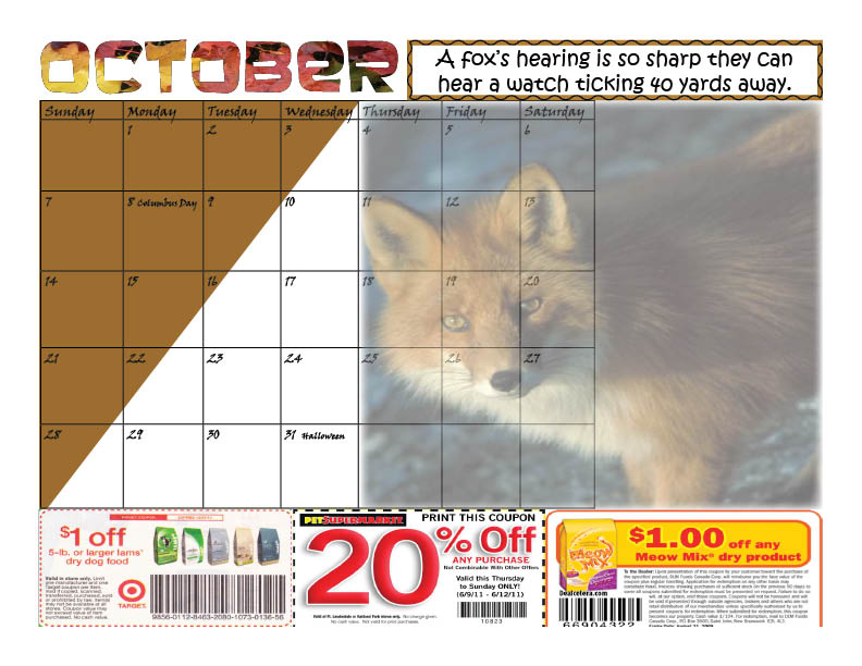
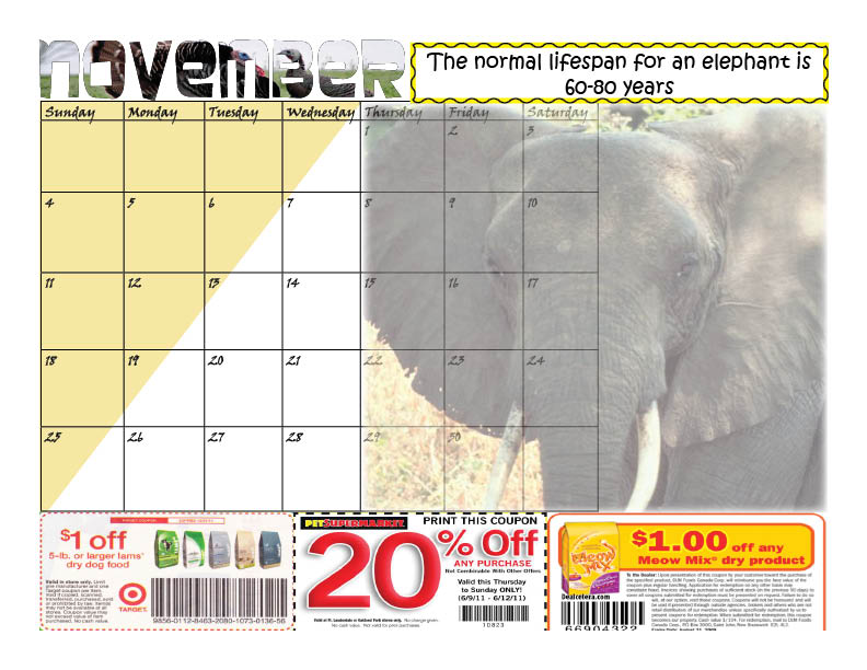
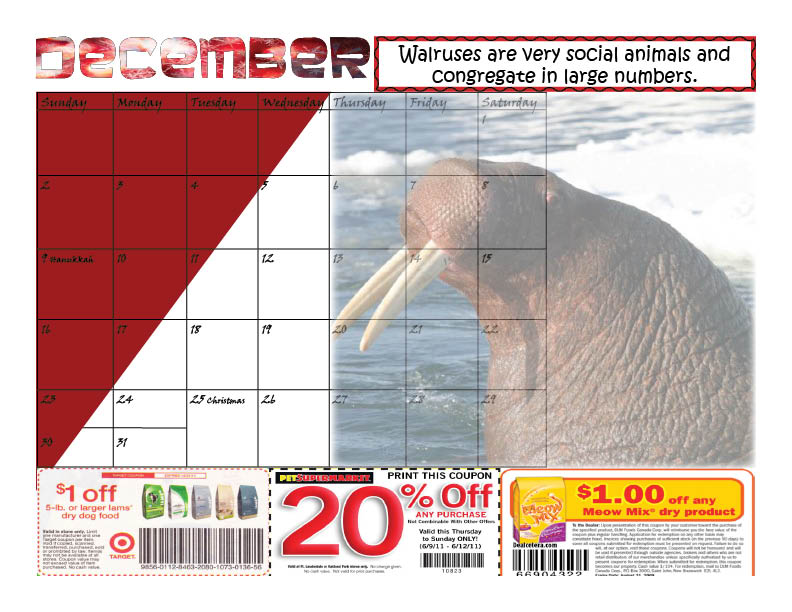
Humane Society Calendar In my calendar, all of the design elements were actively used. Contrast was utilized when choosing the colors between the calendar and the animal picture. Each calendar has a triangle of color within the calendar grid. I wanted to make the triangle darker than the actual animal picture. This contrast was achieved by adjusting the transparency of the animal pictures.
Repetition was also another major player in this design. I was sure to repeat the format of the calendar by placing everything in the exact area of the page every time. Every picture, coupon, grid, or heading is in the exact same place as the other. This consistency provided an aesthetically pleasing calendar.
Alignment helped with making the calendar appear to be more clean and organized. Everything falls along a grid and is lined up accordingly.
The readability of the design is very good and I believe that the fading of the animal picture is creative. Instead of a regular design, this particular design has an intriguing focal point.
The humane society should be pleased with this calendar because it provides everything they need. There are facts about the animals featured, coupons for pet owners, and an eye-appealing design.
The project is shown below: