


Magazine Ad: Sawdust Annual Art Festival
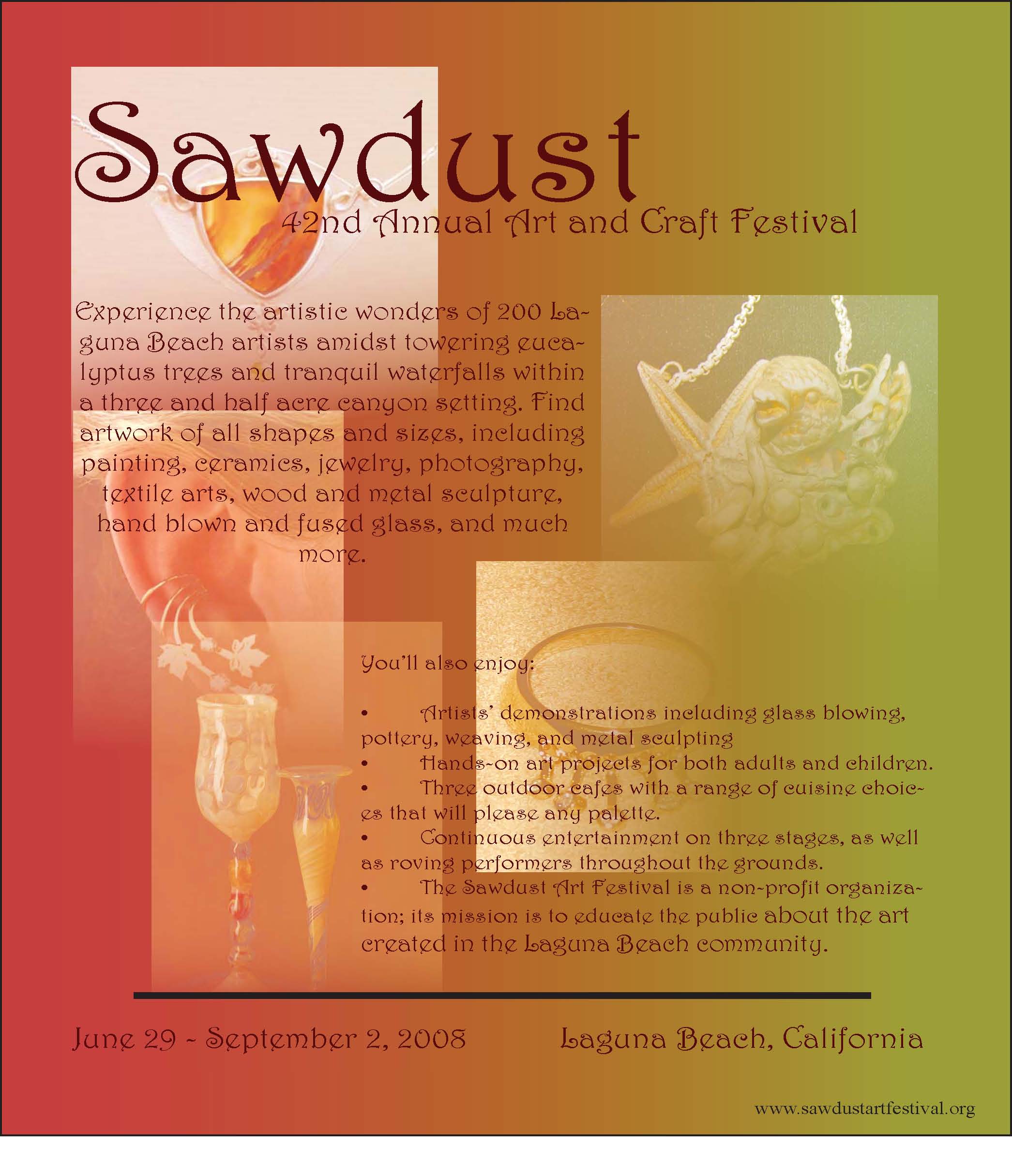
For this assignment, I chose to showcase the art that had previously appeared in the art show. I did not align the pictures because I wanted to go for a mosaic, “artsy” approach. I wanted the audience to see the artwork that would be displayed at the festival. I blended the pictures to give some visual appeal to the advertisement. The pictures also mirror the description of the artwork in the introductory paragraph of the advertisement; visual aids to the description would help the audience understand the type of crafts that were available at the festival.
My color scheme represents the color scheme of the festival which provides enough color but is not overbearing; the red, green, and brown reflect the actual logo for the Sawdust Festival.
Though the advertisement is for families, I thought that the design was appropriate for adult readers. The font is whimsical yet sophisticated and the font color is not extreme.
The flyer below was the end product: